


Enhance Your Analytics With the Gantt Chart, New Budget Report, and Formula Improvements


Gantt Chart in the Agile Module
You probably know what the Gantt chart is and how to use it. It’s a simple tool to analyze activities within a project against the timeframe. Each activity (in Flowlu, it’s sprints and epics) has its own bar, which shows when it was started and ended. Sounds pretty simple, right?
Even in its natural state, the Gantt chart is a handy tool to analyze your projects, but here in Flowlu, we decided to go far beyond the frames. In a nutshell, we made the Gantt chart more usable, so you can not only analyze but also manage a project via the chart.
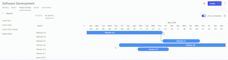
What you can do with the Gantt chart in the Agile module:
- Analyze the duration of your sprints and epics. Each type of chart has its own tab in Agile reports.
- Change the start and end dates of activities on the chart by dragging bars .
- Zoom in and out to change the display of the timeframe.
- Set relations between different activities.
To learn more about how the Gantt Chart works in Flowlu, explore our knowledge base.

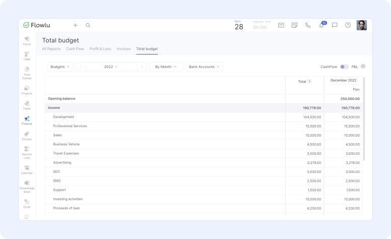
Total Budget Report
Remember the Budgeting module that we released at the beginning of the year? Now, you can create an overall report that includes all your budgets. It will help you to observe the overall finances of your company for all business lines without manually allocating budgets from different companies if you run multiple of them for years or quarters.
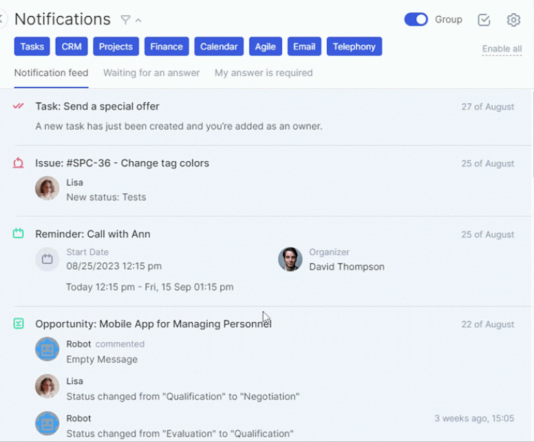
Redesigned Notification Board
Our old, good notification board was redesigned. Now, it’s more intuitive, and you won’t miss any important updates. All recent notifications are now displayed separately from the old ones on the upper part of the board. You can quickly mark all or optional notifications as read by clicking one single button. Also, we added two new tabs where you can find all requests waiting for your answers or see who hasn’t answered you yet.
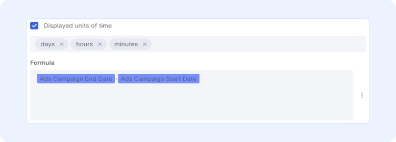
Time Unit Options for Custom Formulas
We improved our formula fields, so you can now display the total number in days, hours, or minutes. It will help you customize your CRM opportunities and projects more carefully, as well as quicly calculate the total price of your services in Flowlu.
A Gantt chart is a type of bar chart that illustrates a project schedule. It is a visual way to represent the tasks involved in a project, their dependencies, and their start and end dates. Gantt charts are used in project management to help plan, track, and manage projects.
A total budget report is a document that summarizes the financial information for a specific period, such as a fiscal year or quarter.
- To visualize the project timeline.
- To track the progress of the project.
- To allocate resources effectively.
- To communicate the project plan to stakeholders.
- To manage dependencies between tasks.